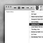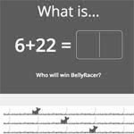


A good exercise in JavaScript. Given static images for different states, the project was to recreate the entire interface using JavaScript, HTML and CSS. In previous work places, I've often been the one responsible for the design which then was handed off to developers. So, it was pretty interesting to be on the other side; the big difference being that I've since added a good foundation in programming. I was pretty pleased to have replicated the design to pixel perfection, but the code was still considered raw. Something to note, regardless.
Notes given: Only needs to work in the latest version of Chrome. Things should line up and look symmetrical but please don't bother measuring. Just estimate heights, widths, padding etc. Don't worry about persistence or AJAX or anything like that. Cards should occur in the order of addition with newest being at the top-left. Don't worry about form validation, the photo is optional. After clicking the X as shown on hover, the card should be removed from the page, and the other cards should fall into place. Photo URL can be to any image on the internet. Don't worry about proportionate scaling, just force it to a square. If no photo is provided, the default image (included) should be shown.